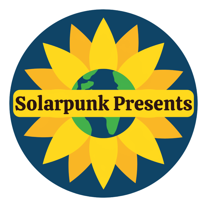
Introducing Our Shiny New Logo
To go along with our shiny new website (that is still under construction), Ariel and I decided we needed to do something about the podcast's logo. Or logos, as the case was, seeing as we seemed to have several that ranged in quality from cringe to ho-hum.
Case in point, our first logo, which I threw together mainly to convey the correct pronunciation of Solarpunk Presents.
Because, although it's kind of fun to have people wondering whether or not we mean it as something along the lines of Solarpunk Presents This Very Interesting Special Guest Speaking About This Very Interesting Topic (said in the solemn tones of a Masterpiece Theater presenter), what we're presenting are visions of solarpunk in the here and now.
But this first logo is a major fail because while it conveys the pronunciation, it delivers the wrong concept. Sure, we hope we're delivering solarpunk gifts of visions of the solarpunk here and now (solarpunk presents of solarpunk presents, if you will), but the important part are the visions of the here and now.
The next logo we latched onto tried to remind everyone that a big part of solarpunk is loving our Earth and treating it well and remembering that we're a part of it.
It's also kind of rebelling against solarpunk's fixation with solar logos (or at least offering a gentle counter to them).
Christina still really loves this logo. She loves the spinning, sparkly Earth. She loves the fonts and the way they look so crisp. But Ariel is not a fan. She thinks we should put the solar back into solarpunk. Also, while Christina reads SP Presents as Solarpunk Presents, Ariel reads it as Solarpunk Presents Presents. "It's just as bad as ATM machine!!!" she cried. To which Christina could only look embarrassed because she's been saying ATM machine for about 40 years and never noticed the redundancy.
And so began the long process of coming up with a new logo. It turns out that coming up with a good one isn't that easy, especially if you aren't an artist and don't have the sort of equipment/software that makes designing things exactly the way you want them possible.
So, there were many missteps and disagreements during the weeks of tinkering, sending stabs in the dark back and forth for inevitable rejection by one or both of us... Looks too much like a giant GM sunflower! Love the corona! No, wait! Hate the corona... makes it too busy! Chunky typeface over my dead body! Etc...
In the midst of all this, it was easy to think, but we're not Coca Cola! Or McDonald's?! We're a podcast, not a brand! Why do we even need a logo?
But, when you stop to think about it, logos are a totally normal human thing. People have been branding livestock and stamping goods with symbols to represent their producers since at least several thousand years BC. People baking bread in communal ovens still mark their loaves with something like a family logo. Honestly, the use of things akin to logos must go back as far as written language... which started out using pictograms... or maybe even further back than that. It's not hard to imagine that people have been using symbols or little pictures to represent themselves, their identities, their creations, and their property for tens of thousands of years.
And so, with this fine tradition in mind, we finally settled on a new logo.
We hope you like it, because we think it's beautiful!


